
Candy: Wow. Is there a name for people who like having group sex with mannequins? Les freaques aux plastiques? Jesus. And I thought Furries were bad.
The hand placement for the guy on the right is also muy, muy creepy. Makes me think he’s about to pop her head clean off, then run around the house swinging her head manically before hanging it from the ceiling fan.
Sarah: I have often asked myself, “Self, what ever happened to Clay Aiken?” Self, now you know.
Nothin’ sexier than a skinny man with no shirt. And a shoulder-sunburn. From being buried up to his clavicle.
Victorious Star Cover – NOTE: NOT WORK SAFE
Candy: Aaaaahahahahahahahahahahahahaha.
*stops for breath*
HAAAAAAAAhahahahahahahahahahaaaaa.
Oh God. That woman sure has some bitchin’ bangs and maroon eyeshadow, though I guess I should be grateful it’s not aquamarine. And the way the man’s hand is curved around her right hooter makes it seem as if it has no give at all. You’d think in the far future that plastic breastables would be more realistic, but apparently not even science that allows us to conquer faster-than-light travel can make breast impants lose that jello mold look. WORST. COVER. EVER.
Sarah: Candy totally has me beat on the “Dude, who does that dude look like?” contest. That dude totally looks like Jason Mewes. That’s so sad. Jason Mewes with a Legolas hairdo.
I have to ask Hubby who the other dude looks like. Damn, Hubby can’t figure it out, either. Ok, someone has to help me figure out who that dude looks like.
And that is the most horrid cover I have ever seen. Dear God. I need to lie down.
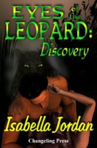
Candy: Guy: Unhhhh! Unnnh! Oh baby!
Girl: YES! OH YESSS! Ram that fleshy sword of love into my love chunnel, you stud!
Leopard: RAARR! Take it up the ass, bitch!
Sarah: Leopard 1: “I say, Jerome, there appear to be some rather beefy people engaging in some, shall we say, activities out in yonder swamp. “
Leopard 2: “Never!”
Leopard 1: “True, I am afraid. At this moment, in fact. Hear them?”
Leopard 2: “I do, indeed. Hm. Well, I am feeling a bit peckish.”
Leopard 1: “Oh, it has been a long time since you’ve eaten. Go on.”
Leopard 2: “Are you sure?”
Leopard 1: “Oh, yes. Go on. Enjoy. Bon appetit.”
Candy: Guy: I’m either constipated, or like Keanu Reeves, this is my Look of Passionate Intensity.
Girl: Is it in yet? I’m kind of bored.
Leopard: WOO, TITTY! Even ghostly leopards need titty. Oh yeah. OH YEAH. Much better than that chick’s from Victorious Star.
And once this guy leans over he’s going to get it up the ass, too.
Sarah: “Even ghostly leopards need titty.” A truer saying was never, er, said. *sniff* Just the price of a cup of coffee each day could give ghostly leopards their own titty. Imagine the difference you could make.
I won’t even go near my normal “What was the art department thinking?” ruminations. I can’t even imagine, unless their goal is to Not Sell Books.

Holy shit. The Victorious Star cover literally took my breath away. I can’t stop looking at it. Talk about trainwreck.
I think the second dude looks like a -sunburned and blackeyed version of the guy who played MacGyver.
“Leopard: WOO, TITTY! Even ghostly leopards need titty. Oh yeah. OH YEAH. Much better than that chick’s from Victorious Star.And once this guy leans over he’s going to get it up the ass, too.”
I laughed out loud. Great stuff!
I think Emma said it best: Holy shit.
Holy. Shit.
I’m a little afraid of my cat now.
Sick. But funny as hell. The angle just seems wrong on the Victorious Star cover and now … I’ll have nightmares.
OMG – you guys totally crack me up. Here’s an alternate cover for Victorious Star, maybe you’ll like this one better. *g*
http://romancereviewspot.tripod.com/id106.html
Cover aside – this is one of the best books I have ever read. Watch for Morgan Hawke to break into New York very very soon.
I’m going to have to go tell Morgan and Isy about the free publicity – they love good snark.
Well done ladies.
OH MY GOD. I finally figured out who Dark-Haired Guy in the Victorious Star cover reminded me of.
Erik Estrada.
PONCH, NOOOOOOO!!!!!!
“I’m a little afraid of my cat now.”
Just watch out for your titties. For the love of God, Beth. WATCH OUT FOR YOUR TITTIES.
“Here’s an alternate cover for Victorious Star, maybe you’ll like this one better.”
Oh God, that one’s miles better. Still cheesy, but not gut-wrenching. Glad (or maybe sorry? God I can’t even tell any more, my synapses have been completely burned out after the massive fight-or-flight-or-laugh-my-ass-off response these covers inspired) to hear that this is a case of When Bad Covers Happen to Good Authors.
ROFLMAO!
– Oh God – you guys WOULD post THAT picture for Victorious Star! Too bad it’s not the cover for the book itself! It’s a rendition done because the artist liked a scene in the story.
But Seriously! Thanks for the promo! I think you just boosted my sales Big Time! LOL!
Great work ladies! LOVE your cover-snarks! Keep it up!
Morgan Hawke
http://www.darkerotica.net
When I read Victorious Star, I saw it with this cover: http://www.loose-id.com/detail.aspx?ID=99
I’ve never seen it with the one you posted, but I have to agree with the Morgan Hawke assessment. I just finished reading Fallen Star, having read Fortune’s Star and Victorious Star first.
At times, VS was a bit more than I was ready for, but OTOH, the world she’s created is an awesome read. Fallen Star and Fortune’s Star were awesome!
I think the non-Jason Mewes guy on the VICTORIOUS STAR looks like Mark Gastineau.
http://wwwimage.cbsnews.com/images/2001/03/05/image276381l.jpg
bbwwaaaahhhhhhhhhh
I would think Jason Mewes is so gonna wonder in here on day and be so pleased you guys thought of him.
I do so heart kevin smith.
After checking I have Victorious Star in my tbr. I think you guys was moved it up to read.
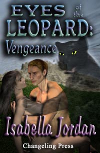
You guys should really do more ebook covers. Out of all of the ones you did, Eyes of the Leopard: Vengeance scares me the most. Hell and I don’t even have a cat. I think it is Keanu look of passion that might give me nightmares.
Damn, must wait until I get home to sample the rich awfulness of the nont WS cover.
I second the call for more ebook cover snark. They so richly deserve it. (And yes, I know that epublishers have severe budget limitations, but still—simple, elegant font on a solid background would be vastly preferable to every ebook cover I’ve seen yet.)
Pages and pages of squares of simple font on a blank background. Nothing but words and colors. Uh, yeah. Right.
I didn’t realize the purpose of ebook covers was to make the publishers’ websites look good—I thought it was to sell the books.
::shrug:: Bad photo-montages just don’t do anything for me. But I realize book design is a specialized field, and maybe there’s a reason for them.
They are to sell the books. And yes, there is a reason.
Blank covers with text will only sell if the name on them is known. In ebooks, the majority of authors are either brand-new or relatively unknown. There has to be something to draw the eye, since the name can’t do it alone.
And yes, Poser in the wrong hands can be a trainwreck. But it can also create some quite nice art.
These are some I really like:
http://www.ebookad.com/coverart/xsize/x19987.jpg
http://www.zumayapublications.com/title.php?id=114
http://www.ebookad.com/coverart/xsize/x20297.jpg
Frankly, I find the whole “All Poser is bad” attitude a bit tiring. Ebook companies labor under cost contraints, and do what they can with what they have. The idea that escapes some is to learn from your mistakes, and practice with your software. Improve. Learn. It can get better.
The problem occurs when someone buys Poser and three weeks later is convinced they’re a professional artist. It takes time and practice to learn ANY art…even computer-generated.
LOVE the Hell Kat Cover.
I actually bought Fetish in Paperback even though I have the eBook because of the cover. Wish it were a poster. First – The title. Second – hot guy in thigh high boots and nothing else …
Send them an email. Posters are easy…they may start making one. Do they have a store?
A lot of authors have CafePress Stores as well..I know Vivi Anna has one. You can make your own stuff with your art. I get some cute stuff that way.
Oops, just realized…
Artist credit:
Hell Kat cover by Vampi
The Capture of Kelly Winchester: Martine Jardin
Too Many Secrets: Martine Jardin
I agree that not all Poser 3D covers are bad. The ones I’ve seen featuring naked (or mostly naked) people in clinch poses, however, have all been horrible. I mean, real-life cover models have a hard enough time pulling that off; having what look like SIMS do the same thing bumps the fugly notch that much higher.
Here are a couple of covers I really liked:
Timewalkers 1
Angel is a Centerfold (her breasts are a bit too porntastic for my tastes, but hey, she’s a centerfold)
I also don’t get why badly-rendered models of naked people are so prevalent. There are so many other ways to convey that what lies within is a sexy story.
For example, extreme close-ups of fruit and flowers. A burning-hot novel about a young woman learning the art of the humpty-hump could have as its cover an extreme close-up of a peach, or if a human MUST be present, then maybe a 3D model of a woman’s mouth biting into the peach.
Or use objects to signify what’s going on. The book is a sexy space saga? Then show some kind of futuristic Big Bad Gun, partially obscured by a pair of silk panties and a garter belt. There’s bondage in the story? Then throw in some leather restraints, too.
Or use human silhouettes.
Or hell, for erotic romantic comedies, cartoon covers wouldn’t be out of place. They don’t all have to look like they belong on a YA novel; a close-up of a mouth sipping a champagne glass could look pretty damn sexy.
Or use Headless Wonder shots. These are already used quite frequently, but they look terrifying because the unnatural contrast makes the muscles on the men look really, really creepy. Soft shadows and the Photoshop blur filters are your friend, people! Use them judiciously.
Or, for example, the covers for the two Eyes of the Leopard books. Why show two people humping at all with the leopard joining in for a truly terrifying threesome? Why not modify a stock photograph of a reclining panther? To indicate that it’s a love story, one could Photoshop a woman’s arm draped over the panther. Hell, even a 3D model of this sort of thing would look better than the feline boob grab-fest. Just my opinion.
Other problems for these covers that are not at all related to the bad Poser models: The bad fonts (WHY must some of these books use 2, 3 or more clashing fonts, why why why oh for the love of God please read a book or two on the principles of design and font use), love of cheesy Photoshop effects like the lens flare, egregious abuse of the drop shadow and chisel effect, etc. I mean, we Smart Bitches do it for our aristocratic titles, but those are MEANT to look silly.
Just my opinion. I’m willing to bet some people very likely love these covers, too.
Yes, exactly, Candy. It’s in the manipulation, the artist’s ability, and the concepts. You have to learn to work with Poser’s limitations, on top of doing it over and over until it looks right, smoothe the edges, match the font,etc…
Mind if I take notes? Loving your ideas. We’ve been moving in that direction with our art.
Go right ahead and take notes, Stef. Personally, think part of the image problems romance novels in general and e-book romances in particular lie with the large number of really, really bad covers. Creating covers that look professional AND sexy isn’t easy, especially with the budget contraints many e-book publishers have, but it can definitely be done, and it can only help the image of e-books.
Oh, and that cover for Fetish gets a lot of things right:
– No cheesy-ass clinch
– Pose looks very sexy—it reveals just enough and hides just enough
– Shadows and contrast are nicely adjusted, so the muscles don’t look terrifying
– Nice close-up of the eye
– Fonts aren’t flashy or annoying
– No cheesy Photoshop effects
The only thing I’m not fond of is the man-titty. Whether it’s because the guy is incredibly fit or incredibly tubby, I’m not a fan of the man-boobs. But that’s very much a personal thing.
Good deal. If we use it, you get concept credit on the copyright page.
I agree. We’re planning on redoing a lot of our covers in future, especially some of the really old ones.
Moving more toward stuff like this:
http://www.ebookad.com/coverart/xsize/x17709.jpg
http://www.ebookad.com/coverart/xsize/x19196.jpg
Bird of Paradise: Jane Sommers
Slave Heart: Martine Jardin
A: I just screwed myself and clicked the link to diable the email notifications for posts here – someone please fix me?
B: Slave Heart: Martine Jardin ? The same Martine Jardin that lives in Canada and scares the shit out of crappy writers? She was my first and only critique group! I love her! Small world.
Oh wait – I think I can fix myself. Ignore.
Interesting… I like the covers that Stef posted, but I like them because they look much more like drawings/paintings than the faux-photograph style of many of the Poser covers. The Poser people do not look real – especially their faces don’t work for me. Whereas when something looks more like a drawing, it doesn’t worry me.
And I worked that out about my preferences even before I’d had my morning cup of caffeine. Amazing.
Actually, Bron, a graphic designer with a verra cool blog called RobotJohnny expounded on a very interesting robotics theory on just this topic. It’s called the “uncanny valley,” and basically it talks about how people tend to like anthropomorphic objects, but once the resemblance becomes too close (yet not close enough), we become uncomfortable and switch to dislike—that is, until the object achieves perfect human mimicry. Which, frankly, explains why many of the Poser covers bug me. They try too hard to be photorealistic (especially the clinch and action sequence covers) but don’t come close enough which results in them looking like oversexed mannequins, while the ones I like definitely resemble paintings more than attempts at photorealism.
Could be—She does live in Canada. Martine is the president of eXtasy/Zumaya, one of four partners. She is our art director as well as an artist.
Exactly about the making paintings effect. We learned this through trial and error. Poser just can’t emulate photos well enough, and there was much frustration when it didn’t work.
Authors wanted hunk and clinch covers, but we just didn’t like the turnout. So the artists started working in a different mindset, and you see the result. Even the hunk covers now have that painting look to them.
Ferfe,
You’ve got Martine curious now. Can you send her an email at extasy @ extasybooks.com and refresh her memory? Thanks.
FONTS are abused repeatedly on ebook covers. There are a lot of nice fonts around, even for free, but the same tired old fonts are used again and again, and every single one gets the same Photoshop layer effects (Bevel/emboss, plus drop shadow or a stroke outline) when getting rid of the bevel/emboss would greatly improve the look of the cover. Also, sometimes it seems like artists put a *lot* of work into the cover, and just about any old font is slapped on top of it, so long as bevel/emboss is used, and it is just about any color – you want fonts to be easy to read, but a good portion of the time you see “standard” fonts like Times New Roman or variants being used, or bad script fonts. Much decent art is ruined with bad fonts…I am odd about fonts, I know.. I start conversations with others in the car about fonts for the brand id on new cars being sleek and sans-serif and on old cars being scriptlike or being serif-style fonts, etc, and a lot of votes of mine in the recent AAR cover contest were font-driven…because, really, the right font makes a cover look sophisticated, and the wrong font looks like someone’s high-school project. most of the time I’m quite impressed with Ellora’s Cave covers, which have come a LONG way since the old days of ec…but recently someone has used the “fake Coke” font (I have Loki-Cola installed on my computer) for a few things, eg: http://www.ellorascave.com/productpage.asp?ISBN=1-84360-333-0&Page=Page2 and http://www.ellorascave.com/productpage.asp?ISBN=1-4199-0052-8
and all I can say is, “It’s got nothing to do with Coca-Cola, don’t use a fake Coke font for that, it just looks wrong.” I don’t even notice the rest of the cover, all I see is a Coca-Cola font.
OTOH, recent EC covers I’ve liked: http://www.ellorascave.com/productpage.asp?ISBN=1-4199-0149-4&Page=Page1 (Look, different fonts for author and title, with author font repeated in subtitle. Script font that’s not cheesy and sparing use of bevelling.)
or http://www.ellorascave.com/productpage.asp?ISBN=1-84360-646-1&Page=Page1 (The fonts have effects, but they seem to go with the subject matter, mimicking glass and neon lights rather than simply applying an outer glow for no reason) or http://www.ellorascave.com/productpage.asp?ISBN=1-84360-671-2&Page=Page1 (Which has great simple font usage even if the lower picture is um, skirting the boundaries)
I also notice that I do wind up prejudging EC books by their covers when authors are unfamiliar to me, because in general it seems better covers = print publication = SOMEONE thinks these authors sell better. It doesn’t mean I won’t take a chance on books with not-so-great covers, if it sounds good or has a recommendation, but even on the online shelves, the covers do have an influence.
Shame on you bitches—you didn’t even feature a single Floating in Nothingness Goggled Eyed Poser cover with some 3D poser action. Get back to the ebook world and find yourselves some naked bodies unanchored in a scene. They’re not too hard to find, dammit.
I’m intrigued by the Victorious Star book because of the blurbs and writing, but even that second much improved cover gives me the Poser willies. [not that sort of willy…..hey, speaking of whichI’ve never seen poser willy. Thank goodness for small favors.]
I like the fruit plan. Some of those Thea Divine covers are Art.
I have seen Poser willy. It’s terribly real-looking. And usually very large.
The Very Tall Husband has MADE Poser willy. And Poser boobs. And given his juvenile sense of humor, they were… big. Like, “can be seen from outer space even on a cloudy day” big.
Oh. Dear.
Poser Willy? Poser Boobs? Oh dear God. I wish Suprnova was still around so I could get me a copy and give it to Hubby. He’d have a ball. Or, balls.
And Candy, I think we need to read us that Victorious Star book. For, you know, review type purposes. And also, to leave that humpity hump hump cover out on the coffee table when the mothers in law come visit.
Shame on you! Those covers are giving me visions I’ll have to pray for five hours to get rid of!
And that Vengeance leopard is just…plain…wrong…
Poser can be scary in the wrong hands. My brother has worked with it for some years now, incorporating Photo Shop to refine and change things. He’s actually a brilliant pencil sketch artist, but prefers Poser *sighs in disappointment*
However, he’s very good with this software, also offering mods to it for any Poser users interested. Here are a few examples of his work:
http://www.renderosity.com/viewed.ez?galleryid=554207&Start=25&Artist=wyrmmaster&ByArtist=Yes
http://www.renderosity.com/viewed.ez?galleryid=456433&Start=25&Artist=wyrmmaster&ByArtist=Yes
http://www.renderosity.com/viewed.ez?galleryid=905112&Start=1&Artist=wyrmmaster&ByArtist=Yes
Unfortunately, if you skim through some of his other works, you’ll note he also has an unabashed obsession for giant breasts.
Aw, man, registration needed to view the pictures. *pouts*
“Unfortunately, if you skim through some of his other works, you’ll note he also has an unabashed obsession for giant breasts.”
And this is different from the average heterosexual male HOW? 😉 I mean, my husband isn’t at all ga-ga for big breasts but even he couldn’t resist the siren allure of creating poser models with gigantic freakin’ knockers.
“Shame on you!”
Shame? Hmmm. What is this word, shame? I know not what it means.
“Those covers are giving me visions I’ll have to pray for five hours to get rid of!”
I have to admit, I thought nothing could beat some of those Fabio covers he did for Johanna Lindsey… until I came across the Victorious Star graphic and the pervy leopards.
Anyway, if you look at the covers long enough, I believe enough scar tissue builds up in the part of the brain responsible for emotion (particularly disgust) and you develop a tolerance for this sort of thing.
That’s my theory, anyway. Care to confirm it? :vampire:
Anyway, if you look at the covers long enough, I believe enough scar tissue builds up in the part of the brain responsible for emotion (particularly disgust) and you develop a tolerance for this sort of thing.
Not even a joke … read it in National geographic two months ago. Brain rot is real!
Oh stop! It works on my kids.
Candy: Hehe. That’s so true.
Your husband would probably LOVE my brother’s work. These are women with cup sizes that probably range somewhere in the quadruple Qs. I love his art, if only he’d get past the gigant-o-tits obsession. He just smiles when I complain about it and tells me “Sorry. I love to draw women with really big tits.” Oh well, as you say, he’s a typical male.
You had to register? Hmmm, that’s weird. I accessed those links without going in as a registered user. Let me see if I can fiddle with it a little. Thanks for the heads-up on that.